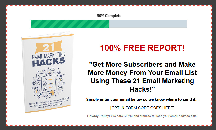
Salespage Snapshot

Sample Content Preview
While it’s a good idea to offer an incentive, you don’t want to make this something too amazing. In fact, a report is almost always better than a free ebook.
There are several reasons for this. Firstly, if your incentive is too good then you will risk attracting people to your mailing list who are in fact not interested in whatever you’re talking about. They will sign up purely to get your free gift and they might then never read any of your emails or even unsubscribe as soon as they have what they want! This skews your data and of course damages your sender reputation, so you want to avoid it.
The other issue is that if you plan on selling an ebook later on, giving away a free ebook will seem to undermine the value of that product. If you are giving one away for free right now, then why would someone be willing to pay $100 for the next one? Especially seeing as they probably haven’t read the freebie yet…
10. Use Storytelling
Storytelling is precisely what it sounds like: telling stories! In other words, when you write your next email, try to frame it as a story. Instead of dispassionately describing the merits of a certain technique or product, instead try talking about how it helped you and how it changed your life. Set the scene, describe the emotion and generally get your audience invested in the outcome. This is a far more engaging way to explain something and it’s actually much more persuasive as well.
11. Use the Recipients’ Names
Your autoresponder contains a feature in it that allows you to include the recipients’ names in their emails. This will automatically replace the {Name} tag in every single message so that they say ‘Hi Joe’ or ‘HI Dave’ instead of just ‘Hi’.
Now, I used to not be a fan of this technique. Everyone can see through this and it’s clear that it’s not personal and that just makes it seem emotionally manipulative. As it happens though, using this strategy has been shown to help you avoid ending up in the ‘Social’ or ‘Promotions’ inbox because it looks like natural and normal correspondence. That’s good news – so use this strategy!
12. Be Brief
Whenever you send an email, you always need to make sure that it contains value of some sort. That means it should provide a tip, a lesson, instructions or perhaps just entertainment. Whatever the case, your audience needs to feel that it was worth their time reading that message.
Better yet, you want to ensure that the amount of time they spend is short. If they can get maximum value for minimum time investment, then that will be a more efficient exchange for them and it will feel like even more value. They’re essentially getting more for less! So, learn to write efficiently and get right to the point – be respectful of your audience’s time.
13. Use a Normal Email Structure
Earlier we mentioned that using the first name in your email could help you to stand out and to by-pass the spam filter.
Another trick you can use that will do the same thing, is to try and use a more conventional structure. In other words, instead of creating an elaborate newsletter template with headings and flashing lights, instead try writing a normal email as you would do to a friend. This will feel much more authentic and personal and it will also be more likely to bypass those various filters and make it to the inbox.
14. Ask to be Whitelisted
If you are still facing emails that end up in the spam folder, then one of the simplest and most effective solutions is just to ask your recipients to whitelist you. That means removing you from any spam lists and putting you in the primary inbox rather than the secondary ones.
A great time to do this is in your welcome message for your double opt-in. Your audience will need to see this message in order to sign up and you can warn them that it might go into their spam folder. You can then take this same opportunity to warn them that all your future correspondence might end up there and that they should move you to the primary inbox if they want to be sure they don’t miss future updates.
15. Use a Lightbox
Lightboxes are ‘popovers’ that appear on top of the rest of your content in a window and cause the rest of the site to go black. Normally, they force the user to click ‘OK’ or ‘Cancel’ to dismiss and in most cases, they are promoting a mailing list. While these can be a little frustrating for the user, studies show that they increase conversions by as much as 400% which makes them highly worthwhile.
16. Use a Sidebar Widget
Remember that a lot of your visitors won’t land on your website or blog through the home page. If you have popular blog posts or pages within your site, then you need a sidebar widget that will contain your opt-in form. This way, people will be able to sign-up wherever they land on your site and you’re drive many more conversions as a result.
Other Details- 10 Articles (TXT, DOC)
- 1 Ebook (PDF, DOC), 12 Pages
- 1 Audio (MP3)
- 4 Graphics (PNG)
- 1 Squeeze Page (HTML)
- Year Released/Circulated: 2020
- File Size: 6,062 KB
License Details:
You’re granted master resell rights, resell rights or to resell with personal use rights.
You may add this product to your PAID membership site
You may giveaway the product as a bonus when people buy through your affiliate link
You may edit the included opt-in / squeeze / landing page
You may giveaway the eBook for Lead Generation purpose
No, you may NOT edit the contents of the eBook
No, this product does NOT include private label rights. You are granted Master Resell Rights only


