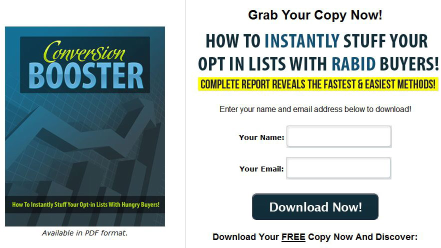
Salespage Snapshot:

>>> Click Here To View Full Sales Page…
Table of Contents
Introduction To Conversion Booster 4
Testing & Tweaking … 5
Types of Opt-In Boxes …… 6
Pop-Over .. 6
Light Box .. 6
Splash Page …. 7
In Post …… 7
Feature Box ….. 8
Opt-in Bars …… 8
Sidebar Opt-in . 9
Types of Squeeze Pages 10
Short Squeeze Pages . 10
Long Squeeze Pages .. 10
Video Squeeze Pages . 10
Squeeze Page Elements 12
Headline . 12
Sub-Headlines …… 13
Bullet Points .. 13
Images … 13
Opt-in Form Fields 14
Text Colors …. 14
Template Colors … 15
Font Size 15
Conversion Booster Page 3
Template Style ….. 15
Eye Flow 16
Privacy Statement 16
Final Words 17
Resources .. 18
Sample Content Preview
Types of Opt-In Boxes
There are many different types of opt-in boxes, and it’s important to test different types in order to find out which type works best for your traffic.
Pop-Over
If you’re a regular internet user, you’ve almost certainly seen pop-over opt-in boxes. These boxes pop up on a web page over the content, obscuring the content from view.
Some webmasters and bloggers refuse to use these, because they claim their visitors will get annoyed and leave, but that isn’t true. Yes, they can annoy some visitors, but as long as the box is easy to close and doesn’t pop up too often, it won’t bother the majority of users. In fact, many people may be glad to have an easy way to opt in for more information, especially if they’ve enjoyed your content.
MarketingSherpa.com posted this timeless article about how they increased their conversion rate by 1000% by using a pop-over opt-in form. You can read that article in its entirety here:
http://www.marketingsherpa.com/article/case-study/how-to-get-1000-increase
Light Box
A light box is a type of popup box that pops onto the page itself, darkening the page in order to draw attention to the opt-in box. Some people find this too intrusive, but they can be remarkably effective.
Darren Rowse of ProBlogger.com made a post on his blog that stated how he experienced a huge increase in opt-ins once he added a light box opt-in form. Not only that, but his traffic did not decrease at all. So the light box was not putting off visitors. He increased his opt-in conversion rate without decreasing his visitors.
Splash Page
Splash pages are becoming more popular these days. A splash page is basically just a very short page that is shown upon someone’s first visit to a website or blog. This page offers the visitor the opportunity to subscribe for more information or to keep up-to-date on the latest information from that site.
You may hear some people refer to splash squeeze pages as being pushy, but think of it this way. Many people actually do want to be informed about subjects they are interested in. This type of squeeze page gives visitors the chance to opt in, and if they choose not to subscribe they aren’t shown the page again. If you use this type of squeeze page, be sure you make it so it will not keep showing it to visitors every time.
At the bottom of the page, visitors should be presented with a link to skip to the main site if they don’t want to opt in to your list.
In Post
Another potential location for your opt-in form is within your blog posts or articles. If you have great content, this can be remarkably effective, because the quality of your content will naturally make people want to hear more from you.
This type of box works best when you put it at the end of your blog posts or articles and use text such as “If you liked this article, enter your name and email address for more content like it.”
Feature Box
Many blogs have a featured area at the top that is typically used for displaying featured posts, but this can be one of the most effective places to include your opt-in form.
In fact, you can even have special functionality built into your blog that will replace the opt-in form with featured posts or something else once the visitor has subscribed. This means you won’t lose that valuable space by wasting it on people who have already joined your list.
Opt-in Bars
An opt-in bar sits as a small strip at the top or bottom of the page. It is less obtrusive than other types of opt-in forms, but it may be less noticeable. The good news is that because this type is so subtle, you can use it along with other types of forms to draw additional attention.
Many people prefer to use the slide up opt-in form, which is a type of opt-in bar. You can you a service like HelloBar to create this type of bar on your site.
>> https://www.hellobar.com/
Whenever a visitors clicks that bar, the opt-in form will drop down.
Sidebar Opt-in
One of the most popular locations for an opt-in form these days is in the sidebar of a blog or website. It is simple to set this up using a blog, because a text widget makes it easy to paste the code for your opt-in form.
This location isn’t a good space for a generic opt-in form. You’ll want to offer something enticing to get visitors to join your list, because you have very little space with which to convince them to subscribe. A free report or e-Book is usually a good choice.
You could also create a highly clickable banner and place that in your sidebar, linking it to your regular squeeze page. This will allow you to use your sidebar while still making the most of your traffic with a well-designed squeeze page.
Types of Squeeze Pages
You may be surprised to know that the length of your squeeze page can make a huge difference to conversions. Some people feel strongly that a short squeeze page is best, but long squeeze pages can perform better in certain situations.
Short Squeeze Pages
Short squeeze pages actually do perform better in many cases. You may be tempted to think that “more is better”, but when it comes to squeeze pages, short and sweet is usually the better option.
When all you’re asking for is an email address, and you’re not depending on Google (which isn’t fond of short squeeze pages) for traffic, a short-form squeeze page will generally outperform a longer squeeze page by a large margin.
Long Squeeze Pages
Long squeeze pages are required if you’re trying to get a lot of traffic from Google, especially AdWords. They want to see a long squeeze page with your logo, information about what you’re offering and a lot more.
Video Squeeze Pages
Video squeeze pages are increasingly popular these days, because they can be very effective in many niches, and because they allow you to pack a powerful punch in terms of impact.
Videos convey information very effectively, and now that most people have fast internet, they make more sense than ever before.
When creating a video squeeze page, you want to have a minimalistic design. If a design is too fancy, it will overwhelm the video and distract attention away from it, negating the power of the video itself. Instead, use a design that has few graphics and where the colors complement the video without distracting from it.
Many people use a dark background for videos, because it makes the video stand out. However, be sure the text elements on the page are still easy to read, perhaps by putting them on a white background. One easy way to do this is by making the opt-in form appear to be on an index card, piece of paper, post-it note, or other similar element. Otherwise, you may want to make the entire page on a white background.
Remember, you won’t need a lot of text if you have a video. All you’ll really need is a call-to-action that asks people to subscribe and tells them why they should, along with your privacy statement.
Squeeze Page Elements
There are a number of different squeeze page elements that you can test and tweak to improve your conversions. Some of these elements are critical, and others are not, but still important. However, testing how they interact together can sometimes make elements that aren’t as important much more effective. For example, template colors aren’t generally critical, however when you combine a certain template color with a certain headline, the results might be drastically better than when you use either element on its own. This is why it’s so important to test various things.
Headline
The headline is generally considered the most critical element of any sales or squeeze page, because it’s the first thing people usually read. If the headline doesn’t capture attention and generate interest in the first few seconds, you’ve probably lost the visitor for good.
In fact, aside from the type of squeeze page you use and the location of your opt-in form, the headline is the one thing you absolutely must test if you want to get the best conversions possible.
If you think you’ve chosen the perfect headline to convey your message but it just isn’t performing as well as you think it should, don’t be afraid to test subtle variations. Sometimes all you really need to do to a headline is change the wording slightly or change the way the text is highlighted or underlined and your conversions will increase.
Other Details- 1 Ebook (PDF, DOC), 18 Pages
- 7 Part Autoresponder Email Messages (TXT)
- 1 Squeeze Page (HTML, PSD)
- File Size: 16,932 KB


