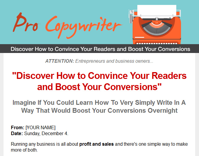
Salespage Snapshot:

Table of Contents
Chapter 1: The Power of the Copywriter.. 4
Chapter 2: The Basics of Good Writing…. 5
Style and Flare………… 7
Flow and Readability. 10
Chapter 3: How to Get Rid of Typos and Errors Forever.. 12
A Question of Grammar……… 13
How to Eliminate Silly Mistakes……….. 18
Chapter 4: Grabbing and Holding Attention…….. 19
Layout and Font…….. 20
Telling a Tale………… 21
Using Rhetorical Questions?.. 23
Making Text Skim-Friendly….. 24
Leveraging Curiosity. 26
Chapter 5: Getting to the Point Quickly for B2B.. 27
Chapter 6: The Value Proposition………. 29
More Ways to Create Desire.. 31
Chapter 7: Encouraging Action. 32
Scarcity and Urgency 33
Removing the Barrier to Sale. 33
Conclusions and Recap………… 34
Sample Content Preview
Chapter 4: Grabbing and Holding Attention
At this point in the book you should now have a good idea of how to write well. Some of this will come with practice but if you keep the tips we’ve covered in mind, your writing should already be more engaging and interesting for the reader.
Now we can dive into the good stuff: understanding the psychology of our readers to try and persuade them to buy from us, sign up to our newsletter or bookmark our page.
And the first challenge you’re going to face in this capacity is just getting them to read what you’ve written. A lot of people are going to land on your pages every day and un-fortunately, most of them will leave within a few seconds of getting there. The average time that someone spends on any website is actually under a minute and most of us can attest to this if we reflect on our own browsing behaviour.
The fact of the matter is that we’re constantly in a rush, we’re desensitized to all the ad-verts we see and we’ve become accustomed to getting the information we’re looking for in a very short amount of time.
If someone loads up your page then and they’re met with a thick wall of text explaining the importance of synergy in a connected business… then you’ll lose them in seconds. You need to be faster and more engaging than that!
Layout and Font
The first thing you need to do to ensure your copy grabs and holds attention is to format it correctly. No matter how good you are at writing, a massive paragraph of small text is never going to be read by anyone who lands on your page.
Instead then, you need to break up your content with lots of short paragraphs and you need to use headings, bullets and anything else you can to space out the information. Likewise, the font itself should be large and readable and you should use big enough line spacing to make sure that it doesn’t look cramped or crowded on the page.
Another tip is to think about where on the page your text is going to be and how the eye will be led to it. A good web design should merge with good content to make sure that the reader’s attention is directed in the right way and not distracted away.
And there are lots of subtle cues that contribute to this. As a rule, we tend to absorb in-formation from top-to-bottom and left-to-right. This means that the information we want visitors to read should start in the top left of the page (or thereabouts). At the same time though, we also tend to look at the largest, boldest and most colourful object on any page first. This will be the element that creates the most contrast.
This is actually why you’ll often see magazines use large, bold and colored letters at the start of articles:
Skiing is a hobby that can be incredibly fun but also somewhat dangerous…
That big ‘S’ says ‘start here’ and helps draw the eye to the beginning of the text.
Subtle cues can even come from the images on your page. Ask whether your image could be interpreted unconsciously as an arrow to draw the eye. For example, if there’s a picture of a person on your page, then chances are that your visitors will automatically look in the direction that the person is facing. This is why people on your page should always look at the text!
Telling a Tale
With your text set up in order to grab as much attention as possible, the next thing you need to do is to try and ensure your text is gripping and that it compels the reader to keep reading. The idea is that your writing should have an almost addictive quality – so that even as the reader tells themselves they should be doing something else, they will struggle to tear their eyes away from the page.
How can we possibly accomplish that?
One tip that is very useful for starters is to use a narrative structure to try and grab at-tention.
This is an incredibly effective method to bring people in and to get them emotionally in-vested in what you’re saying. Why? Because we have evolved over thousands of years to pay close attention to stories. We think of stories as being relevant to us and we are able to place ourselves in the shoes of the people we are reading about. They naturally make use of our in-built empathy and understanding of others and this gives them an even stronger ability to influence us and change our thoughts.
What’s more is that we find it very difficult to turn away from a story because we want to find out what will happen next. If you’ve ever sat up all night watching badly made TV, then you’ll know this well!
‘I knew it was rubbish but I still wanted to find out what happened!’
You’ll often see this strategy being used in sales pages that are trying to sell ‘make money schemes’ or fitness ebooks. They might go something like this:
I find it hard to believe now but I was once REALLY tight for money.
I mean, I once had water on my cereal last year because I had no milk and couldn’t afford to buy any more…
…which wasn’t even as bad as the time I ate cold broccoli for lunch because it was the only thing in my fridge!
Today things are a LOT better. As in, writing this from my private yacht better…
But the way I got here?
Well, it wasn’t quite your normal rags-to-riches story, put it that way!
Using this technique, the content immediately grabs attention because it’s using the first person and it sounds open and honest (of course most of these things are a load of nonsense!). We read the first sentence or two to hear what the person has to say for themselves and because each paragraph is so short, we find ourselves constantly mov-ing down to the next line and scrolling the page as we do.
Many people will be able to relate to the story and when we hear that there was a ‘way out’ we’re intrigued. The fact that the way out wasn’t ‘normal’ only makes it more intri-guing…
And before you know it, you find that you’re continuously scrolling down and becoming more and more invested in what the person has to say!
Some people will react differently. They’ll see this text and think ‘I’ve seen that before, how manipulative’. But you know what: often these people will also read the text partly to see how annoying it is… and this then means they can still end up getting roped into the narrative!
Create a story that instantly grabs attention and then try to make every line or short par-agraph into a ‘mini-cliffhanger’. Ideally, the reader should feel completely compelled to keep moving onto the next line and they may well not be able to stop until they get to the end!
Using Rhetorical Questions?
Something else you’ll often find used in these long sales pages, is the rhetorical ques-tion. This is a question aimed at the reader that of course is not going to get a response but which serves a number of useful purposes as a result.
For starters, using questions creates a small amount of suspense while also breaking up the text.
How?
By getting the reader to second guess what the solution will be and making them wait for a beat before finding out. (See what I did there?)
At the same time, the rhetorical question also serves the purpose of making the reader think for a moment and in doing that, it causes them to engage more with the text.
Finally, the rhetorical question works because it feels as though the writer is talking to you. This again makes you sit up and take notice; similar to when a teacher would say a pupil’s name because they weren’t really listening.
Other Details- 10 Articles (RTF)
- 1 Ebook (PDF), 35 Pages
- 1 Salespage (HTML)
- 1 Squeeze Page (HTML)
- Year Released/Circulated: 2016
- File Size: 1,669 KB
License Details:
yes you may giveaway this ebook.
yes you may resell this product.
yes you may sell/pass resell rights/master resell rights to this product.
yes you may edit the squeeze/sales page.
you do not have private label rightd. you may not sell or giveaway private lable rightd.
you may not re title or edit the content of this product.
you agree to handle any own customer support issues to this product.


