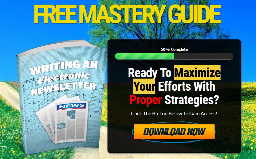
Salespage Snapshot

Sample Content Preview
CHOOSING THE STYLE OF YOUR NEWSLETTER
The style and look of your newsletter is important and one that should not be overlooked. Basically, your style needs to reflect the fact that this is a professional document, not some high school newsletter (many of which actually look pretty professional now).
You need to establish a corporate style in the newsletter, no matter how small your business actually is. Each newsletter needs to be set out in the same style, be written in the same style and have the same format. This ensures that the identity of the newsletter starts to emerge, so that when it pops up in someone’s inbox, they immediately recognize it as a ‘good read’ and will open it.
If you write using different logos, graphics that change dramatically, and so on, then your newsletter may never ever be opened. The trick is to stay consistent! Graphics:
Graphics are really important when it comes to your newsletters. Many writers of electronic newsletters have taken the time to get to know and directly target their readers, have written content that is professional, relevant and interesting, but let themselves down by using clip-art-type graphics that are simply not sophisticated enough for today’s market.
Graphics are important because they can highlight your point, break up a page of text that may seem too heavy and dull otherwise, and simply brighten up a page. But using cheap, rudimentary graphics can simply ‘dumb down’ your newsletter and make it seem cheap. It is far better to use some pictures or images that are more professional looking, even if they cost a few dollars.
Yet there is another danger with graphics: if you use a lot of images at a high resolution, then your electronic newsletter can start to become really big. So big in fact that people will delete it rather than bother to read it, so try to keep your electronic newsletter to a realistic size, some 1-2 megabytes maximum. If you get up to 5-6 megabytes or bigger, then people may simply view it as too big and send it to the electronic trash can, no matter how good your content is.
Layout:
Always place the most important information at the start of your electronic newsletter. So have a title for your first article that really grabs people’s attention. Make sure it is short enough for them to be able to se it before opening your mail; therefore, keep it brief.
Your first page should also contain certain important information, such as your contact details, as well as an option to stop subscribing to the newsletter. Now doesn’t that seem strange? You want people to read your fantastic electronic newsletter, don’t you? So why on Earth would you want to make it really easy for them to stop subscribing to it?
Well, if you show that you are really laid back about someone unsubscribing to your newsletter, then you have not just shown that you respect your readers, you also show that you think that the content of your newsletter is of worth; you have made it easy to unsubscribe because you know that people will not do this, that your newsletter is worth reading!
Obviously, there may be some people who feel that they don’t want to read your newsletter and may indeed unsubscribe, but do not have a faint heart. It is definitely worth taking the risk and being confident. So let them unsubscribe if they don’t want to read it; after all it is their loss, isn’t it?
CONTENT
Content is obviously key to a successful electronic newsletter and many people fall into two big traps when it comes to content. One trap is that a person sits down and tries to write the content, but is suddenly filled with fear. How can they fill the page? What if their writing isn’t good enough? Writer’s block sets in, and many hours are spent simply staring at a blank screen.
The other trap is overconfidence. “Heck, electronic newsletters are so simple. After all, aren’t they just a means whereby I can demonstrate that I know every word of jargon and every big word in the English language? Yep, I am going to blind the readers with the power of my vocabulary. That will really show how intelligent I am, right?”
Well, in fact, both approaches are actually a bad approach. Lack of confidence is as damaging as overconfidence- both are fundamental errors! Writing the content for your electronic newsletter is a bit like riding a bike; you have to learn how to do it, but once you have learned it, then you will be able to simply write without even having to think about it!
Keep it simple:
Put simply, your readers do not want to know that you had an extensive education and that you possibly swallowed a dictionary. They want to have easy-to-read, clear, and straightforward information that is presented in a style that is relevant to their lives or businesses.
Other Details- 1 Ebook (PDF), 11 Pages
- 1 Squeeze Page (HTML)
- 2 Ecovers (PNG)
- Year Released/Circulated: 2020
- File Size: 3,743 KB
License Details:
[YES] Can sell and keep 100% of the sales.
[YES] Can edit the squeeze page.
[YES] Can be bundled into another paid package and sell at a higher price.
[YES] Can be used as a bonus to another product you are selling.
[YES] Can be sold in a Dime sale event.
[YES] Can be added into a paid membership site.
[YES] Can pass on the Master Resell Rights privilege to your customers.
[YES] Can be given away for free AGAINST an email address (lead generation)
[NO] Contents of the product can be edited, modified or altered.


